
Small kitchens can be functional, cosy, and full of personality — but only if the colour scheme works in their favour. When used right, colours can make a kitchen feel brighter, bigger, and more inviting. But when used incorrectly, they can do just the opposite.
Here are the most common colour mistakes we see in small kitchens — along with simple solutions to help you avoid them.
Dark tones like navy, black or charcoal can be stunning — but in small kitchens, they tend to absorb light and visually shrink the space.
The result?
Tip: If you love darker colours, limit them to accents or base cabinets and balance with lighter tones elsewhere.
Cool greys and icy blues might be trendy, but when used too heavily in a small kitchen, they can feel sterile and uninviting.
The problem:
Tip: Mix in warmer elements like wooden worktops, soft beige walls, or brass fixtures to create visual balance and comfort.
While an all-white or all-grey kitchen might seem like a safe choice, too much uniformity can make a kitchen look flat and lifeless.
Why it doesn’t work:
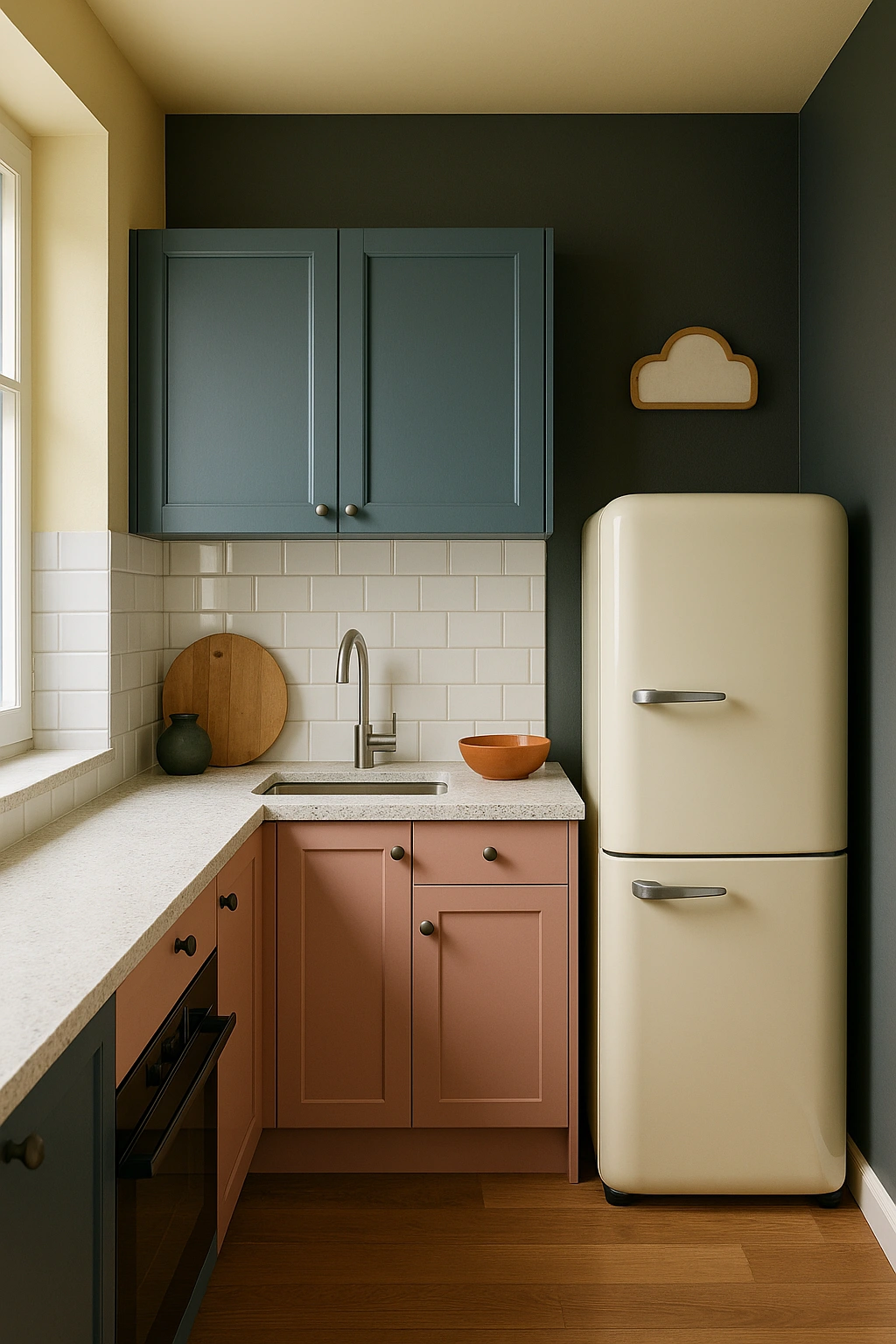
Tip: Use contrast to your advantage — two-tone cabinets, coloured handles, or a feature wall can make all the difference.
In small homes or open-plan layouts, the kitchen often connects directly to the living or dining area. Choosing a completely different colour scheme can disrupt the visual flow.
The effect:
Tip: Choose a colour palette that flows naturally into adjacent spaces. Repeating tones or materials can help your kitchen feel part of a larger, cohesive design.
Even the best colour choices can fall flat without proper lighting. Bad lighting can make bright colours look dull, or cast odd shadows that ruin the overall effect.
Common lighting mistakes:
Tip: Choose warm, layered lighting — especially in key task areas. Use 2700–3000K bulbs for a cosy, natural glow, and don’t forget under-unit LED strips!
Small kitchens have the potential to be stunning — but in a compact space, every design choice counts. A well-chosen colour scheme can:
✔️ Make your kitchen feel bigger
✔️ Improve comfort and functionality
✔️ Create a seamless flow with the rest of your home
Need Help Choosing the Right Colour for Your Kitchen?
At J&D Kitchens, we specialise in kitchen transformations — from colour consultations to professional spray painting, refinishing, and complete makeover services.
📍 Visit our Edinburgh showroom or contact us to schedule a free consultation. 🎨 Let’s unlock the full potential of your kitchen — with colour that works for your space.